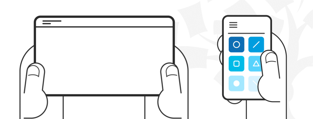
Mobile UX designs are interfaces for hand-held and wearable devices. Designers focus on accessibility and efficiency to optimize these on-the-go interactions.
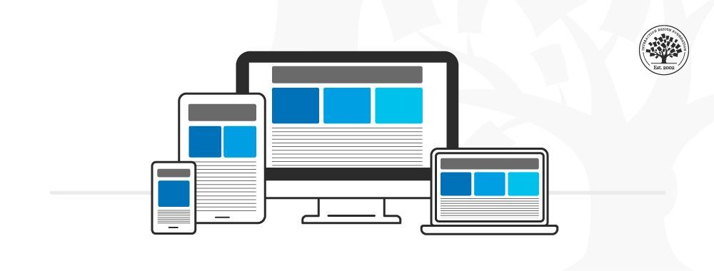
Mobile design has different limitations and requirements than computer interfaces. Many companies have mobile and computer-based designs for identical products. Designers learn to distill essential elements for smaller screen sizes and to optimize their designs for users on the move.
Catering to Users on the Go
The importance of mobile user experience design grew dramatically in 2014 when mobile users suddenly became the online majority. Designers quickly learned they couldn’t simply miniaturize a desktop interface. They needed to reevaluate the needs and limitations of the growing audience of mobile users.
Since then, mobile design has evolved to find the best use of smaller screens.
Experiences are now tailored specifically for mobile environments.
Attention spans are shorter in mobile UX. Users want results fast, with minimal effort and zero friction. They’re often distracted. Signal and power loss are frequent worries. These users often walk and use devices at the same time.
Typically, mobile users find themselves in three scenarios:
Micro tasking: they use devices in short, intense spurt—e.g., to buy tickets.
Local: they use devices to see what’s happening around them.
Bored: e.g., they surf news feed links while waiting.
Tips for Mobile UX
Here are some practical guidelines when designing for mobile interfaces:
Minimize Content:
Smaller screens mean essential elements need to be legible on a smaller resolution. You must make a clean, legible layout to cater to mobile users.
Design for minimal page-loading times. Less than 3 seconds is ideal.
Make an effort to reduce cognitive load for your users.
94% of mobile users use portrait mode. Every pixel of width is valuable.
Keep images small and to a minimum.
Keep a clear visual hierarchy.
Use color and contrast to maximize visibility.
Make text 11 points or larger.
Reduce clutter. Compress information into icons where appropriate.
Complement or frame content with whitespace.
Include card-style design patterns to show actionable content easily.
Ensure all devices can support content.
Keep page descriptions short for bookmarks.
Most users prefer to use their phone in portrait mode, so make sure you design for limited width.
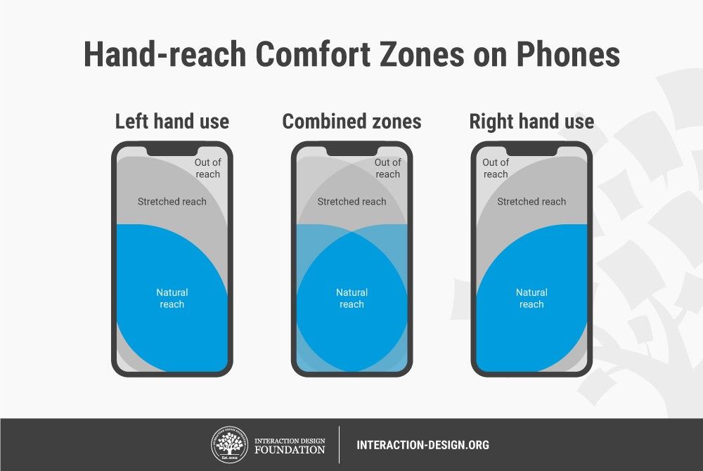
Simplify Navigation: Users might not complete a task all at once. Make sure they don't get lost easily. Also, most users use one hand, and some fingertips are larger than others.
Create 30x30-pixel/7–10-mm (minimum) buttons and tabs.
Use full-screen navigation menus with the minimum amount of menu levels.
Use clear menu labeling, including tabs/icons and graphics.
Prioritize the most-used items at the top of the screen. Consider how far users can comfortably reach.
Give short-key access to features.
Don’t mix navigation patterns.
Clearly show links. Indicate when the user has activated them.
Allow one primary action per screen.
Hand-reach comfort zones
Interaction Design Foundation, CC BY-SA 4.0
3. Restrict User Inputs: Users become frustrated when they have to continuously tap buttons. So, design to offer maximum effect for minimum interaction/effort.
Keep URLs short.
Pre-fill or minimize required data inputs on forms.
Include alternative input mechanisms (e.g., voice-controlled).
Allow permanent sign-in.
Allow minimal, one-directional scrolling.
Retain data in case connections fail.
Offer obvious search features (e.g., a magnifying glass).
Use skeleton screens to reassure that the system is executing background actions.
Ensure Continuity and Consistency: Let users continue where they left off so they can switch easily between mobiles and desktops.
Keep content consistent between screens. If you design separate versions, don’t compromise user trust with unsubtle changes.
Maintain continuity; let users track orders, etc. just as easily on mobiles.
If you design separate versions, let users switch from mobile to desktop formats freely.
In the “Build Your Portfolio” project, you’ll find a series of practical exercises that will give you first-hand experience with the methods we cover. You will build on your project in each lesson so once you have completed the course you will have a thorough case study for your portfolio.
Mobile User Experience Design: Introduction, has been built on evidence-based research and practice. It is taught by the CEO of ExperienceDynamics.com, Frank Spillers, author, speaker and internationally respected Senior Usability practitioner.